https://www.flickr.com/photos/lozzietheunicorn/sets/72157650965314959/
This are my favourite photos from the shoot, edited.

Friday 24 October 2014
Thursday 23 October 2014
Poster Plan

 I really want a simple poster; as a new band they wouldn't have huge billboard posters, and as a niche genre they wouldn't have as much money as a band/artist in the pop genre.
I am unsure as to whether I want a plain white or black background. The white suggests indie whereas the black suggest rock.
The grey blocks are to show a black and white image of the band. The pink box is where I want the album cover to be. The green box is where I want the information/ date of release.
Conventions for Digipak
The conventions of a digipak of the Rock genre would include:
- Photo of the audience
- Photo of band in studio
- dark/ gore iconography
- arty front cover
- track listing
- relevant font for the genre
- Monochrome colours
- Red
The conventions of a digipak of the Indie genre would include:
- Black and white photos of the band
- Artsy cover
- Sepia/ monochrome imagery
- track listing
- relevant font for the genre
The conventions of a digipak of the Electronic genre would include:
- Purple/blue tones
- Neon colours
- lights
- live audience
- live performance
- photo of band in studio
- obscure front cover image
- bold font
Recorded Feedback
This is the recorded feedback given to me by my teacher.
To Do:
To Do:
Poster plan layout (to go with the digipak)Production LogConventions of a digipakDecide the Bonus feature of DigipakTurn photos into digital brainstormPitch powerpointEdit photos
Tuesday 21 October 2014
Font Feedback

From this feedback from the fonts; I think I disagree with the chosen best font. Therefore, I will try all fonts that have been selected by my audience.
Test Shots
https://www.flickr.com/photos/lozzietheunicorn/sets/72157650965314959/
(click the link to see all photos)
These pictures are test shots for my digipak. I like the photos where i have used depth of field. I plan to edit these photos like in the plan for my digipak. Perhaps I could use these photos to create a lyric book?
(click the link to see all photos)
These pictures are test shots for my digipak. I like the photos where i have used depth of field. I plan to edit these photos like in the plan for my digipak. Perhaps I could use these photos to create a lyric book?
Monday 20 October 2014

Friday 17 October 2014

Tuesday 14 October 2014
Digipak plan and stuff

This is my digipak plan (so far).
1. (Pink circle with lines through it) I plan to have the band members face aligned and edited with a neon colour scheme for the front cover.
2. (The green and grey thing with grey blocks) This is the back cover, the grey block represent track listing. I plan to have a landscape image with the image of the band faded into it.
3. (the sound board) To represent the electronic side, I plan to have an image of the studio/ instruments/ sound board.
4. (The audience) I want an image of a live performance/ audience to represent the rock/ indie genre, but also the neon lights to show electronic. I think this will work well since there will be a dvd accompanying the cd within the digipak.
5. (The question mark) I am unsure what to put there as of now.
6. (They grey circle) A Chiaroscuro image of the band - shows them as a brand.

I tried another generator - which I don't really like.

I found this font on dafont, which I would like to try.
Experimenting
I was influenced by neon signs like these:

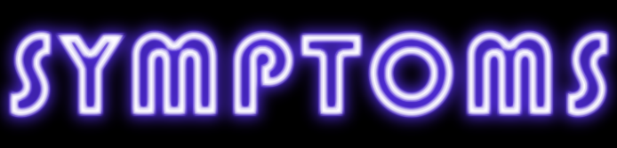
I found an online generator and used that - but I'm not sure how I feel about it.


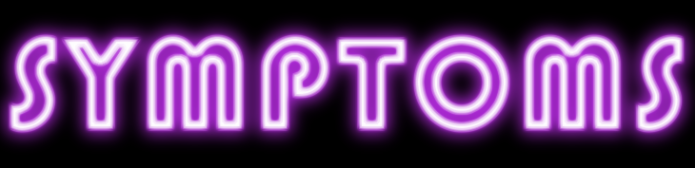


Perhaps I could create a sign for Symptoms that follows this.
I found an online generator and used that - but I'm not sure how I feel about it.
So I created my own version which I dislike. I think I should use glowsticks or find a font that would make it work.
Stuck
I think I'm really stuck for ideas right now; what I want my artist to look like and how I want my digipak to look.
I looked at bands that were similar to my own.
The Killers:

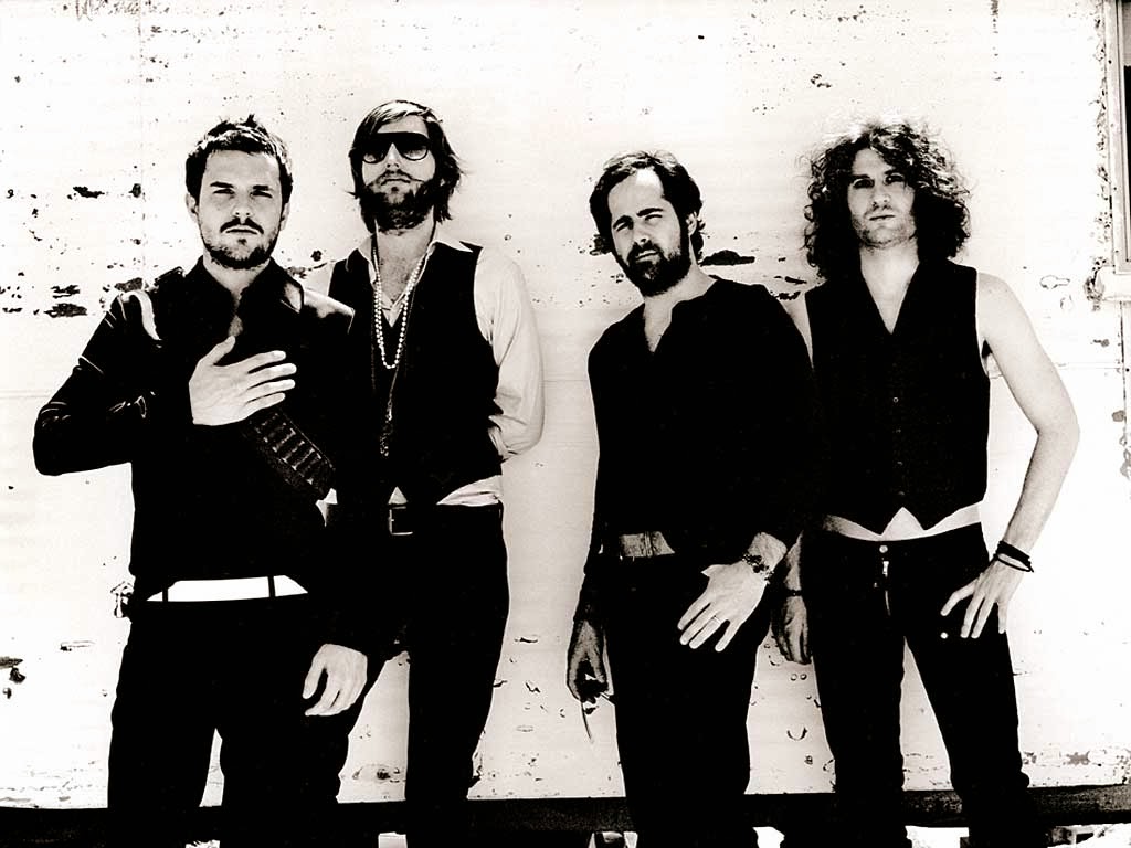


I think it could look aesthetically pleasing for my digipak for the band.
I looked at bands that were similar to my own.
The Killers:
This is what the band look like; I like this casual style that they wear, but I think it's a little too dressy for my band. I like the use of colour in the album cover and is something that I would like to use on my own. I have an idea of neon colours to be used in my album to adhere to the conventions of the electronic genre.
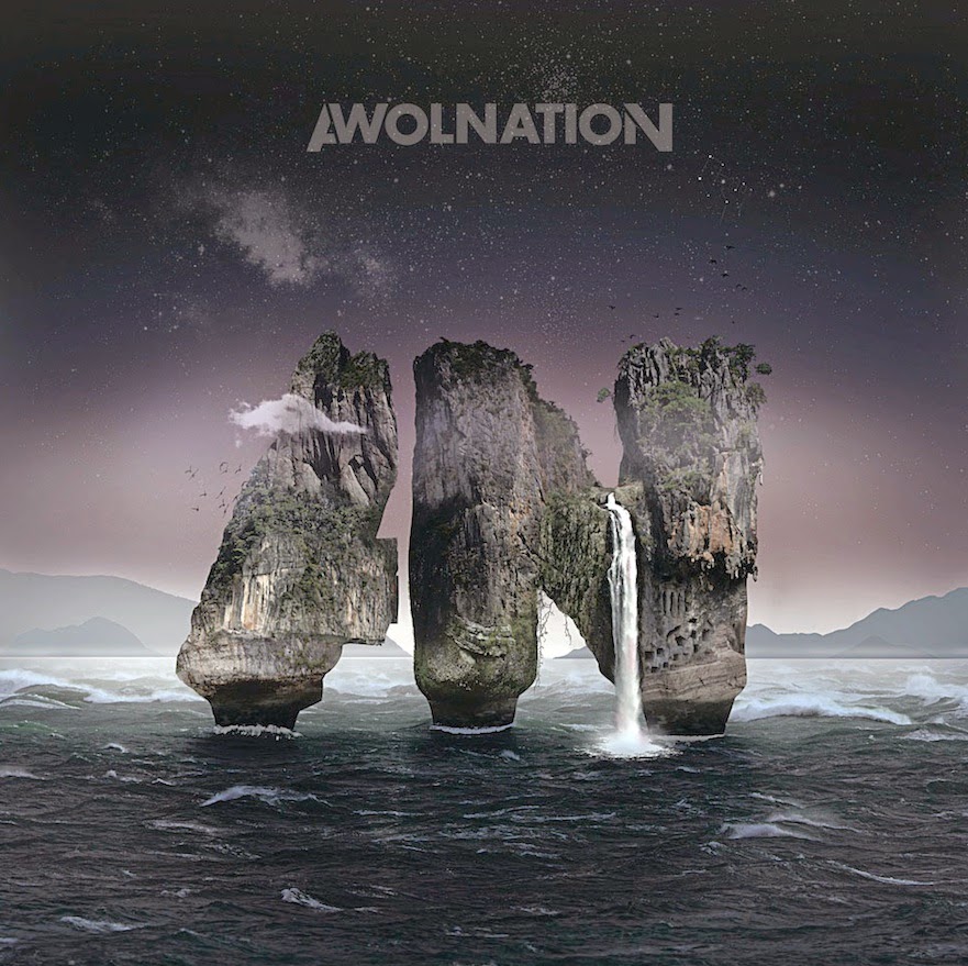
AWOLNATION :
The like the style which AWOLNATION wear; I think it's really casual and laid back - something I want my band to be similar to. I like the obscure album cover and the colour palette, which is conventional of the genre for Electronic Indie Rock.
Foster The People:
I like the artsy image for the album cover; I would really like to illustrate something so this album cover; if not then play around with editing photographs from the photo shoot I will take. The band also wear casual clothes like AWOLNATION which I really like and think connotes my band well.
Overall, I think I want my artist to look similar to this:
I still think that the band Symptom, should focus more on the frontman rather than the band behind it. I think maybe 2 or 3 other guys that look similar to this would be enough to complete the band.
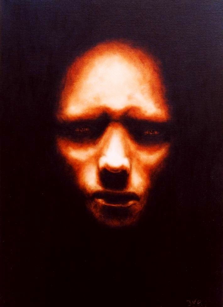
I think if I take some chiaroscuro images such as these:
I think it could look aesthetically pleasing for my digipak for the band.
Wednesday 8 October 2014
More Artist Research
I decided that I wanted my artist to be a band but focus more on the lead singer; like Florence and the Machine. These are the names I came up with.

I eventually decided that our band would be called Symptoms and the album would either be called Ghostland or Spirited Away.
Symptoms is signed to XL Recordings as they create music and sign music artists in the same genre of rock, indie and electronic.
The lead band member's ideology is to follow your dreams (as that's what he did, growing up around music and dedicating his education and life to it).
Symptom's influences are; Arcade Fire, The Kooks, The Killers, Awolnation, Foster The People, and The Filthy Youth.
Likes: hiding, Halloween, dark spaces, diversity and making music.
Dislikes: vibrant colours, cheesy music, sun, X-Factor (or processed shows similar)
The next step is to create music video that shows this.
Tuesday 7 October 2014
Creating Artist
I began to brainstorm all different genres to begin creating my artist. I had the most for Rock genre, so I then started listing off sub genres and artists/bands related to each sub genre.

I found that Alternative rock was hard to define, so I came up with my own definition:
ALTERNATIVE ROCK - CHALLENGING THE NORMAL CONVENTIONS OF ROCK (DOESN'T FIT INTO ANY OTHER SUBGENRE)
I found that I was stuck between two sub genres of rock: indie and alternative. I then created a Venn Diagram for it.

I then circled 5 artists I felt like fit the image for my artist and wrote out any notes or conventions.

I found that Alternative rock was hard to define, so I came up with my own definition:
ALTERNATIVE ROCK - CHALLENGING THE NORMAL CONVENTIONS OF ROCK (DOESN'T FIT INTO ANY OTHER SUBGENRE)
I found that I was stuck between two sub genres of rock: indie and alternative. I then created a Venn Diagram for it.
I then circled 5 artists I felt like fit the image for my artist and wrote out any notes or conventions.
Artist Planning
Name: ??????
Age: 23-25
Musical Genre: Indie Rock
Style: 90's grunge/ tshirt and skinny jeans
Physical appearance: Skinny, white, tall, blonde/brown hair
Album title: ???????
Track Listing: ???????
Artwork: ???????
Background information: From New York (USA). Graduated from College with a Music Tech degree. Started out in the industry as a music technician/ sound check guy for a rock band and continued up the ladder in his career.
Talents: Playing keyboard + digitally creating music
Interests: Keyboard/ music/ computers
Family: Close family, modern values and atheist religion
Friday 3 October 2014
Culture Industry
During today's lesson we became X-Factor Judges to help us understand how to sell an artist.
(Production of Culture/ Culture of Production - Paul Du Gay, 1997)

The way cultural items are produced is the same to how other industries mass manufacture consumer goods. As a company might make a car, everything is lined up and then things are changed. So a car would get the engine, then the body and so on and the music artist would get a new body, new clothes, new hairstyle, make up etc. Music has been corrupted by productions and administrative regin of industrial capitalism. The X-Factor has corrupted us as an audience as it produces the same thing the create mass audience taste.
Eventually, we become numb to everything in the music industry and like whatever is churned out. Everything is set in place to make money.
The Celebrity Making Machine stresses the repetitive and routine character of cultural production.
Baudrillard said 'Nothing is original, everything is the same.'
Music is written so it is standardized and becomes catchy - so it gets stuck in the audience's head. Songs are based around repetitive sequences and recurring refrains. The songs imprint and provoke sales.
Pseudo Individuality: Makes claim to originality, but only contains superficial differences.
An example of an artist that doesn't fit the standard (which was then rejected by the mass audience as we all have the same taste) is Maverick Sabre.
v
(Production of Culture/ Culture of Production - Paul Du Gay, 1997)
As Cheryl Cole my group had decided that we wanted a unique sellable young male artist with a sob story.
We watched some audition tapes and decided what we would say to the auditionee's face and what would be the plan. The plan for most of the auditionee's was to change their look and target them to a specific audience.
Introduce Adorno + Horkeimer's (Culture Industry)
There are three stages of this theory:
- Standardization
- Pseudo Individuality
- Capitalism
AN ARTIST IS A COMMODITY
The way cultural items are produced is the same to how other industries mass manufacture consumer goods. As a company might make a car, everything is lined up and then things are changed. So a car would get the engine, then the body and so on and the music artist would get a new body, new clothes, new hairstyle, make up etc. Music has been corrupted by productions and administrative regin of industrial capitalism. The X-Factor has corrupted us as an audience as it produces the same thing the create mass audience taste.
Eventually, we become numb to everything in the music industry and like whatever is churned out. Everything is set in place to make money.
The Celebrity Making Machine stresses the repetitive and routine character of cultural production.
Baudrillard said 'Nothing is original, everything is the same.'
Music is written so it is standardized and becomes catchy - so it gets stuck in the audience's head. Songs are based around repetitive sequences and recurring refrains. The songs imprint and provoke sales.
Pseudo Individuality: Makes claim to originality, but only contains superficial differences.
An example of an artist that doesn't fit the standard (which was then rejected by the mass audience as we all have the same taste) is Maverick Sabre.
Thursday 2 October 2014
Subscribe to:
Posts (Atom)