Sunday 28 December 2014

Lyrics


 I tried to find out the meaning of the song that I have chosen for my music video in order to make the visuals and lyrics more synchronous. The band are not very well known and I have not found any interviews from the band that would suggest the meaning of the song. I went onto a website to go through the lyrics and found a comment section at the bottom of the screen where fans spoke of their interpretation of the song's meaning.

I can see where fans would believe that the song would be about a relationship, however that theme doesn't show throughout each verse. Therefore I decided to look at the verses myself and decide possible meanings.
 'No need to cower' and 'Hiding in the grass' - abuse? fear?

'I've come to pluck you' - deflowering? virgins? sexual abuse?
'Kiss her on the mouth' - relationship?

'I come to the city alone' - trying to leave something or someone behind.


Overall, my thoughts seem to run with abuse and trying to leave.

Perhaps my music video could feature a girl who has been abused and is mentally unstable and tries to leave the unstable household, but is unable to.

Influences for Music Video

In my research I came across a music video I quite like.


The use of changing opacity reminds me of Richard Misrach's work


Which was the inspiration (and also an influence) for the title sequence of True Detective


For my own title sequence I plan to use this style in the performance section of my video when the band are playing.

Wednesday 17 December 2014

Feedback of Rough Copy of Music Video

I had a discussion with Raji, going through my re-pitch and rough cut.

We both agreed that it was hard to understand who was the reflection and who was real. So I need to do something that would show two sides - I still need to fill in the green screen so maybe it will be obvious then. 

After looking for the meaning of the song (which I found a while ago that said about drug addiction), Raji said that looking at the video it mdd her think of the child being mentally unstable and abused - to link it back with the lyrics we came up with the idea that the child is mentally unstable and tries to leave and break the mirror trying to leave, but she can't (because she's being abused). 

Another idea was to have lipstick writing over the lead singer with the lyrics he sings, which I would like to try. 

Raji also said that I needed more variety of shots of the lead singer and more of the second member of the band - which I agree with. 

I need to rethink the concept of the video and maybe get some more ideas so that the video is able to relate back to Goodwin's theory. 

Thursday 11 December 2014

Wednesday 10 December 2014

Influences for Music Video


I am influenced by this music video as the sad narrative inspired me to create something similar but with more meaning as the character changes. I also like that the video is in black and white, which emphasises the narrative and the meaning of the video. It also fits into genre conventions - perhaps something I should also create.


I was inspired by this video as the video has clones of the band, which the band confront - similarly I would also like to create in my own music video, as I want the child in my music video to confront her reflection and destroy her. I also like the pace of this music video as it is synchronous to the music and visuals.


I like this music video due to the desaturated colouring of the video and the dark style which has influenced me to create a similar style in the editing process of my music video.

Tuesday 9 December 2014

Updated Digipak and Poster

Poster (Date placement)


I have tried playing around with the placement of the date on the poster, however I don't think it is as aesthetically pleasing in the original poster. I think it stands out in the centre and is more obvious for the audience, however I will get some feedback.

Friday 5 December 2014

Everybody's Fool - Goodwin Analysis

Influences - TV Show: Damages


This is the title sequence for a TV show that uses the chorus of my chosen song. The TV show is about crime and law. I like the idea of justice and fighting; hence where I got the idea for my music video. In terms of style I like the colour palette used within the title sequence and the idea of dark shadows - like chiaroscuro lighting, which I would like to use for my music video. I especially like the shot of the protagonist lifting her head from a side and front profile which I intend to use as an intertextual reference in my music video. I like the use of depth of field and focus on the characters, which I also intend to use for my music video. I also like the use of slow motion in certain parts, I think it intensifies parts of the sequence which I would like to use in my music video.

Storyboards for Music Video

Updated Pitch


Blog Feedback


To do:

  1. Change shooting schedule
  2. Peel back on digipak - make it more obvious
  3. Play around with the date on the poster
  4. More location shots
  5. Put up the storyboards
  6. Make sure I have and are using the labels: Research; Planning; Construction
  7. More Video Analysis
  8. Commentaries on influences
  9. Rethink some images for digipak
  10. Work on layout of blog

Wednesday 3 December 2014

Updated Digipak and Poster

I received feedback from my most recent digipak and poster.

With the poster, it was said that it looked too traditional and aligned and that I should play weigh the placement more, for example, the places where the digipak would be available should be at the top and not the bottom. The date of release should also be more centralised.

In the Digipak I just needed to show that the CD placement and what the CD would look like and generally tidy up so all the images were aligned and look more aesthetically pleasing. I also needed to change the insert idea, as it just seems like a sale rather than an exclusivity for people that have just bought the digipak. Therefore I altered this to tell the customer that they would receive exclusive merchandise with the code.


Tuesday 2 December 2014

Poster Draft 2


I really like this poster, I think it's a lot more clearer than my previous one and shows audiences where they can buy the music and the social media websites the band can be followed on. I'm not too sure about the logos of where people are able to buy the music as it is not as clear to read the 'amazon prime' logo. 

3rd Draft of Digipak


For my USP I have decided that I want an inserted page that offers customers a 30% discount to the officialsymptom.com merchandise.

I think my digipak feels stronger as there is a key theme running throughout

I also decided that I want my cd to be a cracked mirror as this would relate to my music video, which is the first song on the digipak and ties in the the crackled/ broken glass font I have used for the title.

Digipak Feedback

This is the feedback I got from the class after presenting my most recent draft for my digipak. Overall the feedback I got was to make my whole album grayscale and to retake the pictures that didn't fit the genre. The class also thought I should change my track listing cover to grayscale also. My next step is to complete all these changes and think about what my USP (unique selling point) is of my digipak and how I want to promotional poster to look.


Friday 21 November 2014

Production Log 23/11/14

I went out and took photos for my digipak.

I think I have more variety of images here that can be incorporated into my digipak. I need to edit my favourites and the ones I think will work for the digipak and then add them to it.

(click thumbnail to see all photos)

Shooting Schedule (December) (Music Video)

The deadline for the rough cut is 15th December. Waiting for feedback as to when I can begin shooting my music video (performance).


Today, I just ordered the wig and the fabric to be my green screen which should arrive, at the latest, 2nd December. So if I get the performance aspect filmed before then I can film the narrative straight after the arrival of my items and film that part. Then I can concentrate on editing from the 5th to the 14th.

The wig and green screen arrived - so I will be creating some test shots to see if my plan works.


(https://sharing.calendar.live.com/calendar/private/524ab9e9-4aa3-42fc-878a-cffc7021cf47/65f17776-ecba-406f-a23a-7a091b21791e/cid-74b80ff5b9959d9a/index.html) - Link to see the calendar.

Location shots


This is where I plan for the performance aspect of the video to be. I like that both are clean and open space - this will make it easier for me to film.


For the narrative aspect of the video, I am stuck between rooms. I wanted it to be gritty like from the Chandelier Sia video.


These are the possible places that I could use:

-Sister's bedroom: I like the setting and it shows the girl from an impressionable age, however the room is narrow which would make it hard to film. 


-Other bedroom: Not as personal. but there is space. 


-Dining room: Weird that someone would be applying make up to go out in the dining room. 

-Hallway near door: Gritty like the Chandelier video, not a lot of space or light. Could bring in lights to the set and would have to clear space more for the video. 

Test shots


This weird image is the plan for how I am to film the narrative side to my music video. So the plan is that I will line the mirror with green fabric which will act as my green screen. I will film what the actress does and then film over her shoulder or the reflections reaction. 

In terms of ripping clothes, I will use old clothes. For the cutting hair, I will buy a wig. Since I am buying a wig, it means I can change the hair colour of the actress; I'm going to choose blonde and have the hair in plaited pigtails to show the innocence of the character. For breaking the mirror I am going to have the actress mimic hitting the mirror, hit the mirror with a hammer and have her pull back from hitting the mirror and cut into place. 

Test/Clip: 

Production Log 23/11/14

I went out and took photos for my digipak.

I think I have more variety of images here that can be incorporated into my digipak. I need to edit my favourites and the ones I think will work for the digipak and then add them to it.

(click link to see all photos)


https://www.flickr.com/photos/lozzietheunicorn/sets/72157650973899048/

Wednesday 19 November 2014

Feedback from Pitch

1) I agree that the way the narrative side of the music video is filmed needs to be well thought out. My plan is the line the mirror with a green fabric so I can green screen the part that goes on in the mirror and flip it around when editing. I will need to take some test shots to show if this works. In terms of the reflection cutting hair, ripping clothes, I would have to buy a wig for my actress to wear to be cut and find some old clothes that can be ripped.


2) I think the band name does fit the genre as it is unusual and doesn't feature the word 'the' in the title (which usually bands a band's name more indie; e.g. THE Smiths). Also that is part of my genre therefore I don't think it's that big a of a deal. Same thoughts with the style of clothes.


3) I think the music video would appeal to the target audience as there is a fight sequence and the style of the video will be desaturated/ in black and white.


4) I disagree that there would need to be more close ups. I think there may be perhaps too many close ups.


5) I agree that I need location shots


6) The band is very underground and targeted at a niche audience, which is why they're British. The band isn't perceived like a typical 'boy band' would be, which is why they're not for American audiences (boy band's target audience would be teenage girls).

Friday 14 November 2014

Lyrics


I printed off the lyrics and followed the song, inserting where I would like which shot and type of editing feature I would use etc. 

Friday 7 November 2014

1st Digipak Draft


(Click thumbnail for photos)

This lesson I was playing around with my digipak on photoshop. This is what I have come up with so far.


Wednesday 5 November 2014

Production log 31/10/14

https://www.flickr.com/photos/lozzietheunicorn/sets/72157649058820103/

(Click on the link to see photos).

These are some test shots for my digipak. I don't really like the one's in the underpass of the train but I like the ones in the alleyway and infront of the brickwall. I think the alleyway ones would be great for tracklisting.

My next step is to edit all the best photos and to create a 1st draft of my digipak.

I then need to get opinions on the first draft and plan for a secondary photoshoot.

Tuesday 4 November 2014

Production Log

During the holidays I plan to take more photos.

The only day that myself and two other members (to be part of the band) seem to be free is on a friday. The weather seems to be hot and sunny (unusual for Halloween). I plan to take photos in an underpass and an alleyway. I plan for the band members to wear normal tshirt and jeans, as the band are indie electronic rock, so would therefore be very laid-back.

Friday 24 October 2014

From 1st photo shoot - Edits

https://www.flickr.com/photos/lozzietheunicorn/sets/72157650965314959/

This are my favourite photos from the shoot, edited.

Thursday 23 October 2014

Poster Plan

 I really want a simple poster; as a new band they wouldn't have huge billboard posters, and as a niche genre they wouldn't have as much money as a band/artist in the pop genre.

I am unsure as to whether I want a plain white or black background. The white suggests indie whereas the black suggest rock.

The grey blocks are to show a black and white image of the band. The pink box is where I want the album cover to be. The green box is where I want the information/ date of release.

Conventions for Digipak

The conventions of a digipak of the Rock genre would include:


  • Photo of the audience
  • Photo of band in studio
  • dark/ gore iconography
  • arty front cover
  • track listing
  • relevant font for the genre
  • Monochrome colours
  • Red

The conventions of a digipak of the Indie genre would include:

  • Black and white photos of the band
  • Artsy cover
  • Sepia/ monochrome imagery
  • track listing
  • relevant font for the genre

The conventions of a digipak of the Electronic genre would include:


  • Purple/blue tones
  • Neon colours
  • lights
  • live audience
  • live performance
  • photo of band in studio
  • obscure front cover image
  • bold font


Recorded Feedback

This is  the recorded feedback given to me by my teacher.


To Do:


  • Poster plan layout (to go with the digipak)
  • Production Log
  • Conventions of a digipak
  • Decide the Bonus feature of Digipak
  • Turn photos into digital brainstorm
  • Pitch powerpoint
  • Edit photos

Tuesday 21 October 2014

Font Feedback


From this feedback from the fonts; I think I disagree with the chosen best font. Therefore, I will try all fonts that have been selected by my audience. 

Test Shots

https://www.flickr.com/photos/lozzietheunicorn/sets/72157650965314959/

(click the link to see all photos)

These pictures are test shots for my digipak. I like the photos where i have used depth of field. I plan to edit these photos like in the plan for my digipak. Perhaps I could use these photos to create a lyric book?

Tuesday 14 October 2014

Digipak plan and stuff


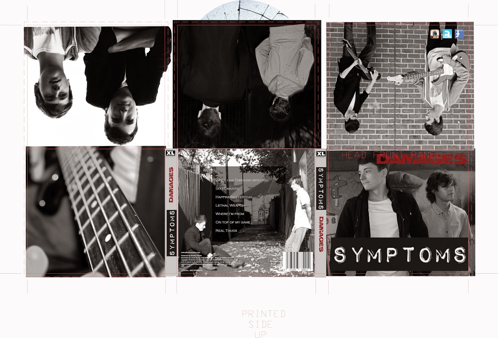
This is my digipak plan (so far).

1. (Pink circle with lines through it) I plan to have the band members face aligned and edited with a neon colour scheme for the front cover.
2. (The green and grey thing with grey blocks) This is the back cover, the grey block represent track listing. I plan to have a landscape image with the image of the band faded into it. 
3. (the sound board) To represent the electronic side, I plan to have an image of the studio/ instruments/ sound board. 
4. (The audience) I want an image of a live performance/ audience to represent the rock/ indie genre, but also the neon lights to show electronic. I think this will work well since there will be a dvd accompanying the cd within the digipak. 
5. (The question mark) I am unsure what to put there as of now. 
6. (They grey circle) A Chiaroscuro image of the band - shows them as a brand. 


I tried another generator - which I don't really like. 


I found this font on dafont, which I would like to try. 


Experimenting

I was influenced by neon signs like these:


Perhaps I could create a sign for Symptoms that follows this. 


I found an online generator and used that - but I'm not sure how I feel about it.


So I created my own version which I dislike. I think I should use glowsticks or find a font that would make it work.